In today’s volatile business environment, people risk is business risk. Every organization, whether a start-up or a global enterprise, depends on its people for growth and innovation. Yet, many leaders still underestimate how human-related vulnerabilities—like skill shortages, high turnover, or compliance breaches—can silently damage performance.
That’s where an HR risk dashboard comes into play. It provides a clear, data-driven view of workforce-related risks, transforming complex human data into actionable insights. This article will walk you through what an HR risk dashboard is, why it matters, how to build one effectively, and what metrics truly make a difference.
Understanding the Purpose of an HR Risk Dashboard
Defining an HR risk dashboard in plain terms
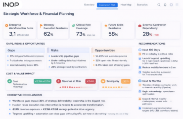
An HR risk dashboard is a visual management tool designed to identify, assess, and monitor key risks linked to an organization’s workforce. Think of it as a real-time mirror reflecting your people-related vulnerabilities—such as turnover risk, skills gaps, compliance issues, or engagement decline—so you can make faster, smarter decisions.
It’s not just another HR analytics tool. While a traditional dashboard focuses on performance and productivity, a risk-focused dashboard aims to anticipate and mitigate threats before they escalate.
Why organizations need one today
According to Deloitte’s 2024 Human Capital Trends Report, 61% of executives consider workforce risk as one of their top three organizational threats. From regulatory changes to AI-driven job shifts, people-related risks are multiplying in both scope and impact.
An HR risk dashboard helps leaders:
- Detect early warning signals across departments
- Prioritize interventions based on data, not intuition
- Align workforce planning with risk management strategies
- Improve compliance and governance reporting
Put simply, it enables HR to move from reactive firefighting to proactive risk prevention.
Key Components of a Human Capital Risk Dashboard
Core risk categories every dashboard should include
While each organization’s risk profile varies, most dashboards should cover the following categories:
- Talent and retention risks – Employee turnover, resignation trends, succession gaps.
- Compliance and legal risks – Violations, labor law adherence, contract mismanagement.
- Operational and productivity risks – Absenteeism, skill shortages, workflow disruptions.
- Cultural and engagement risks – Employee morale, leadership perception, DEI indicators.
- Health and safety risks – Workplace accidents, mental health incidents, ergonomic issues.
- These pillars together form a holistic human capital risk view, giving leaders a balanced understanding of where their organization stands.
Selecting the right Key Risk Indicators (KRIs)
An effective HR risk dashboard is powered by the right KRIs. For instance:
| Risk Area | Example KRI | Threshold/Alert |
|---|---|---|
| Turnover Risk | Voluntary turnover rate | Above 12% per year |
| Compliance | Training completion rate | Below 85% |
| Skill Gaps | Percentage of critical roles without backups | Above 20% |
| Engagement | eNPS (Employee Net Promoter Score) | Below 30 |
| Absenteeism | Average days absent per employee | Above 8 per year |
The magic lies not just in tracking data, but in setting clear thresholds that trigger action. A dashboard that displays data without context is like a map without a compass—it looks informative but won’t guide decisions.
Designing and Visualizing Your HR Risk Dashboard
Making the dashboard intuitive and usable
Design isn’t just aesthetics—it’s strategy. Your HR risk dashboard should be visual, intuitive, and interactive enough for HR leaders, risk managers, and executives alike.
Best practices for visual design include:
- Color-coded alerts – Red for high risk, yellow for medium, green for low.
- Dynamic filters – Ability to segment by department, geography, or time frame.
- Drill-down features – Move from top-level data into specific teams or employees.
- Clear labeling – Use business-friendly language instead of technical HR jargon.
A well-designed dashboard bridges the gap between data and understanding, ensuring non-HR leaders can interpret insights quickly.
Using a workforce risk heatmap for clarity
One of the most effective visualization techniques within an HR risk dashboard is the workforce risk heatmap. This matrix-style view categorizes risks based on likelihood and impact, highlighting which issues demand urgent attention.
For example:
| Likelihood | Low Impact | Medium Impact | High Impact |
|---|---|---|---|
| High | Minor compliance delay | Skill shortage in a key team | Mass resignation in leadership roles |
| Medium | Slight absenteeism | Moderate turnover | Data security lapse |
| Low | Temporary workload imbalance | Delayed hiring | Minimal disruption |
By viewing this heatmap, leaders can instantly spot where to focus resources, preventing high-impact risks from spiraling out of control.
Suggested To read: execution risk indicators
Building the HR Risk Dashboard Step by Step
Step One: Identify your objectives
Start by clarifying what decisions your dashboard should support. Are you trying to reduce turnover by 15%? Improve compliance audit scores? Enhance workforce stability? Define the “why” before deciding the “what.”
Step Two: Collect reliable data sources
Your dashboard is only as good as the data feeding it. Integrate multiple systems such as:
- HRIS (Human Resources Information System)
- LMS (Learning Management System)
- Payroll and attendance systems
- Employee engagement tools
- Performance management platforms
A unified data ecosystem reduces manual effort and ensures accuracy.
Step Three: Establish KRIs and thresholds
Work closely with business leaders to identify key workforce risks. Then assign quantifiable KRIs with target thresholds to measure risk exposure.
Step Four: Build visualization and reporting layers
Use BI tools like Power BI, Tableau, or Qlik to transform raw HR data into visual insights. Automation here is crucial—manual dashboards often lag behind real-time developments.
Step Five: Test, iterate, and communicate
Once launched, test your dashboard with key stakeholders. Ask them what’s useful, what’s confusing, and where decisions can improve. Remember, the dashboard should evolve with your business context—especially as workforce dynamics shift.
Integrating the Dashboard into Strategic Workforce Planning
Once your HR risk dashboard is operational, the next logical step is to connect it to a strategic workforce planning tool. This integration allows organizations to forecast how current risks will shape future talent needs.
For example, if the dashboard shows rising turnover in cybersecurity roles, your workforce planning tool can project the long-term impact on project delivery, allowing leaders to prepare replacement pipelines before crises hit.
This synergy transforms risk awareness into strategic foresight, ensuring that HR is not only mitigating today’s problems but also building tomorrow’s resilience.
Comparing Traditional HR Reporting vs. Risk Dashboards
Many companies still rely on static reports generated quarterly. While these reports summarize HR performance, they often fail to predict issues before they happen.
| Feature | Traditional HR Reporting | HR Risk Dashboard |
|---|---|---|
| Update Frequency | Quarterly or monthly | Real-time or weekly |
| Focus | Past performance | Current and future risks |
| Interactivity | Static tables | Interactive visuals |
| Decision Support | Descriptive | Predictive and preventive |
| Collaboration | Limited to HR | Cross-functional (HR, Finance, Ops) |
This comparison reveals a fundamental truth: while HR reports tell you what happened, an HR risk dashboard tells you what’s about to happen—and that’s where real strategic value lies.
Common Pitfalls When Building an HR Risk Dashboard
Even well-intentioned HR teams can fall into traps when building dashboards. Here are some to avoid:
- Too much data, too little focus: Showing every metric under the sun can overwhelm users. Stick to high-impact KRIs.
- Neglecting user experience: A technically perfect dashboard that no one understands is useless. Test usability early.
- Ignoring data governance: Inconsistent data entry or outdated records can create misleading insights.
- Failing to act on insights: Dashboards are tools, not trophies. Use them to trigger real actions—training programs, audits, or process redesigns.
By sidestepping these mistakes, you’ll ensure your HR risk dashboard drives both insight and impact.
The Future of HR Risk Dashboards
Emerging technologies like AI, predictive analytics, and machine learning are revolutionizing how HR manages risk. For instance:
- Predictive models can estimate the probability of employee turnover months in advance.
- AI sentiment analysis can identify early signs of disengagement through communication tone.
- Machine learning can suggest proactive retention strategies based on behavior patterns.
In the next five years, we’ll likely see HR risk dashboards evolve into intelligent risk assistants, capable of not only highlighting problems but also recommending solutions in real time.
Final Thoughts
Building an HR risk dashboard isn’t just a data project—it’s a cultural shift. It signals that your organization values transparency, accountability, and evidence-based decision-making.
When executed well, it gives HR leaders the power to translate human behavior into measurable business intelligence—and that’s where the future of people analytics truly begins.
So, whether you’re just starting out or refining an existing dashboard, remember: simplicity, accuracy, and actionability are your best allies. Because at the end of the day, a dashboard that drives decisions is far more powerful than one that merely displays data.
Frequently Asked Questions (FAQ)
What is the main purpose of an HR risk dashboard?
It helps organizations monitor, assess, and manage workforce-related risks—like turnover, compliance, or skill shortages—through visual analytics and real-time data.
How does an HR risk dashboard differ from a standard HR analytics dashboard?
While traditional dashboards focus on performance metrics, an HR risk dashboard centers on identifying and mitigating risks before they become major issues.
What tools can I use to build an HR risk dashboard?
Common tools include Power BI, Tableau, Qlik Sense, or specialized HR analytics platforms like Visier and SAP SuccessFactors.
How often should an HR risk dashboard be updated?
Ideally, updates should be real-time or weekly. Static quarterly updates are often too slow to respond to emerging risks.
What is a workforce risk heatmap, and why is it useful?
A workforce risk heatmap visually represents the likelihood and impact of various workforce risks, helping prioritize attention where it matters most.
How can small businesses benefit from HR risk dashboards?
Even smaller organizations can use simple dashboards to track absenteeism, compliance, and turnover trends, preventing costly surprises down the line.
How can I link my HR risk dashboard to long-term workforce planning?
By integrating it with a strategic workforce planning tool, you can forecast how current risks affect future staffing, ensuring sustainable business growth.
